Comra
Summary
Comra is an early-stage start-up providing 3D virtual tour solutions to users regardless of expertise and without the need for any special equipement. The company did not have a dedicated UX designer, and wanted to design the experience of creating a virtual tour with a focus on simplicty. I conducted a competitive analysis, designed the logo
Context
Comra is a start-up based in Sweden that allows users to create 3D virtual tours of their homes without any special equipment using AI. This was a short-term project that I worked on, where I was the only dedicated UX designer on the team.
Research
I was not able to conduct any research with actual potential users due to budget and time constraints set by the company, as they wanted to release a minimum viable product (MVP) as soon as possible, and improve it over time.
I had a meeting with the founder where I got to understand the concept of the app, competitors, target audience, and any business constraints.
In addition, I conducted a competitive analysis on Matterport, one of their competitors. I researched their target audience and app functionality, then mapped its information architecture and the user flow of creating a virtual tour.
Branding
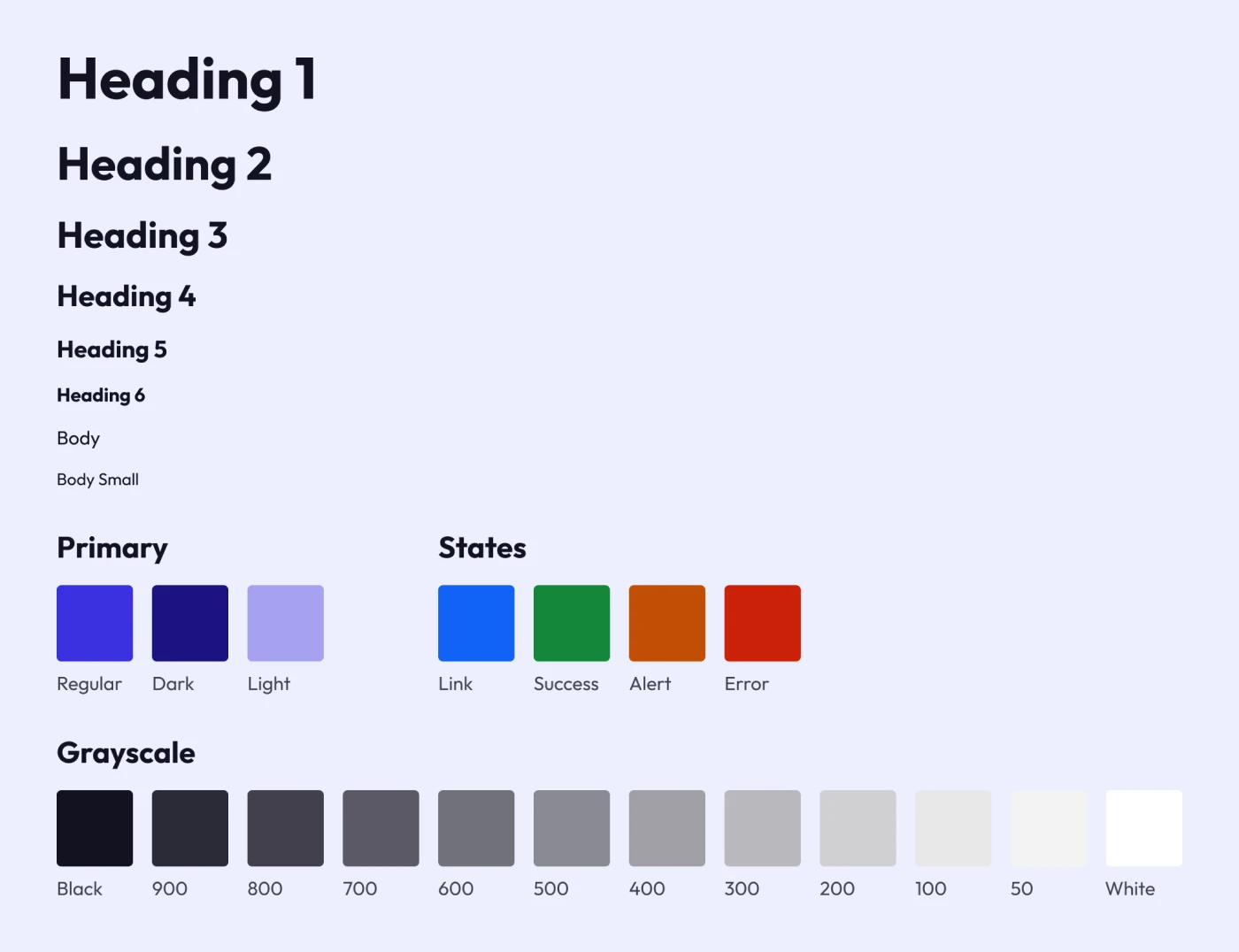
When it comes to branding, the company was already using purple as a primary color, so I kept that. For the typeface, I used one that portrays a bold clean look. In terms of icons, I used an open source set called “Phosphor Icons”.
When it comes to the logo, the founder wanted a 3D design of the letter C, as their work is 3D-related. I went through different iterations while presenting them and getting feedback, and settled on one variation that also makes the letter C look like a house.

Landing Page
As Comra was developing their app, they had a landing page for potential users to view the features and request early access. However, I noticed that it can be polished and improved using UX design principles, so I came up with a new design and created the following prototype.

The company used the new design, but I did not manage to test it with potential website visitors beforehand.
Structure
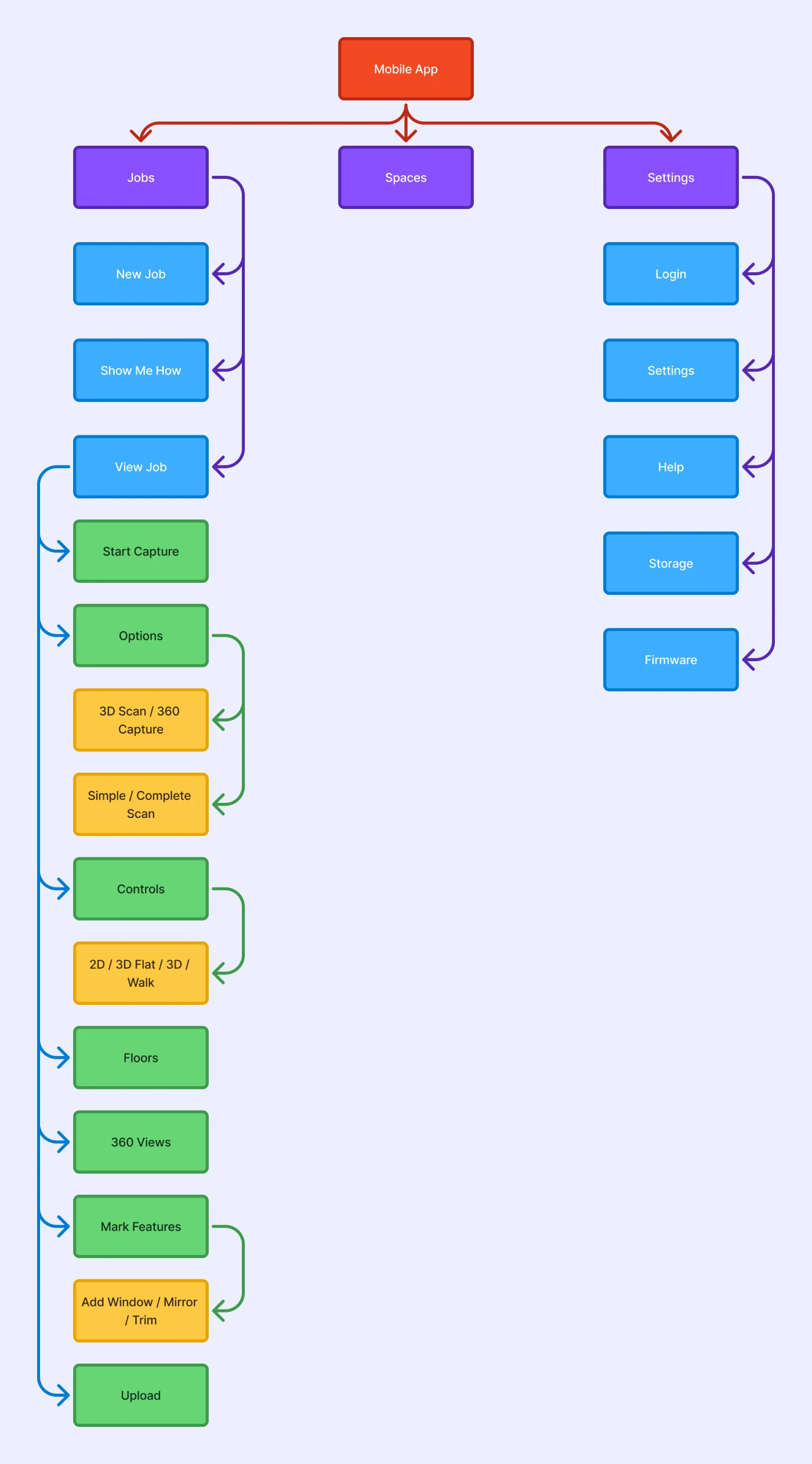
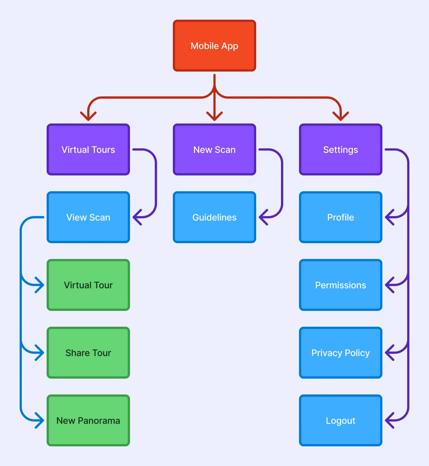
Comra wanted to create a very simple scanning experience that allows anyone to quickly learn it and be able to create their own virtual tours. Based on that and my previous research, I designed the following information architecture.
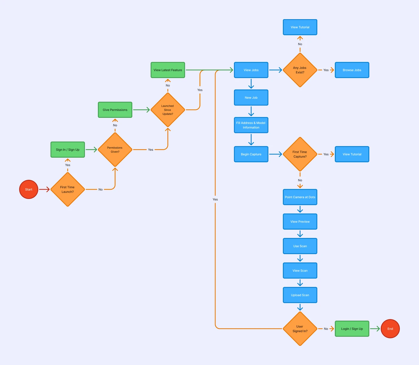
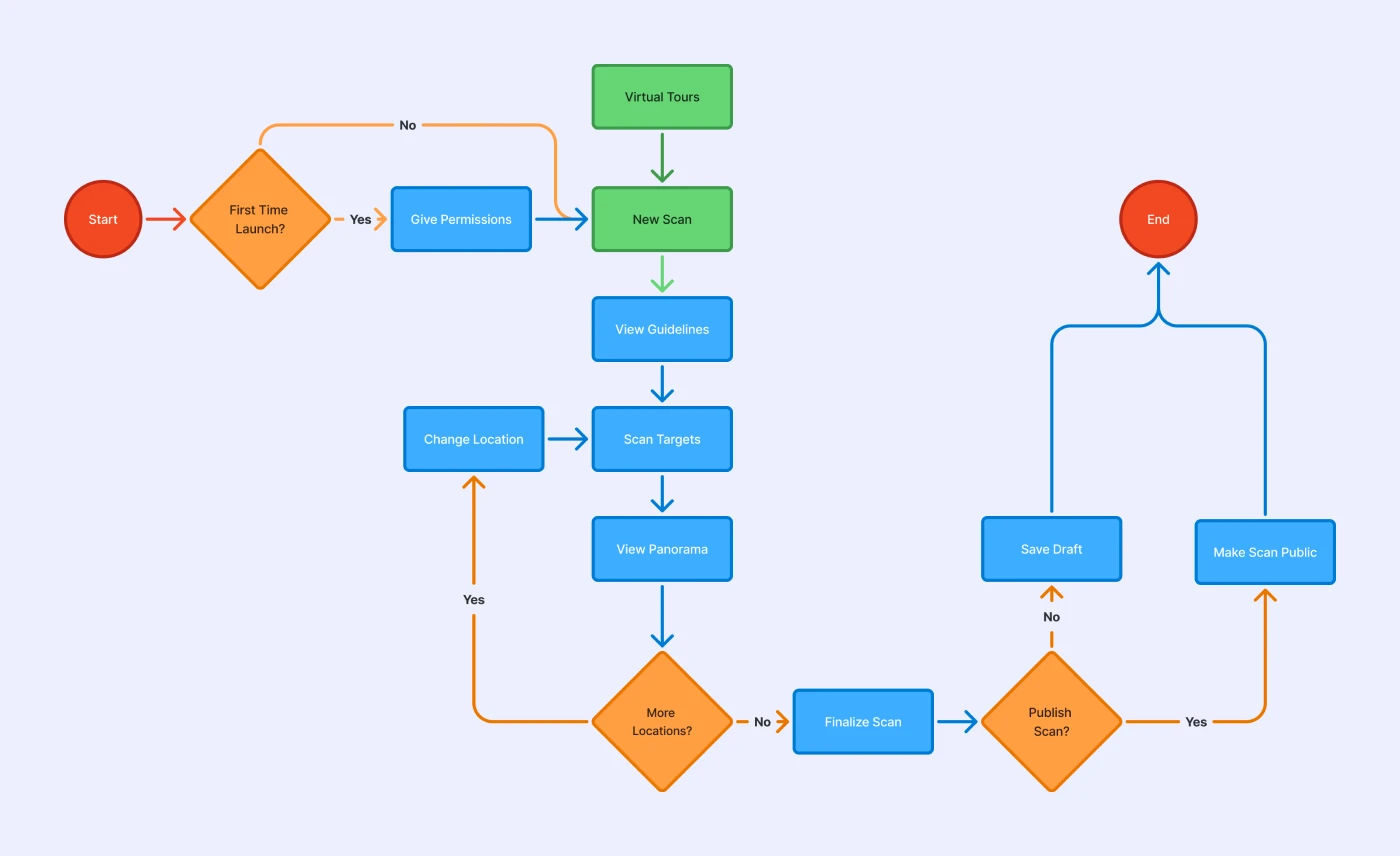
In addition, I designed the user flow of the process of creating a virtual tour, to ensure simplicity.
Prototype
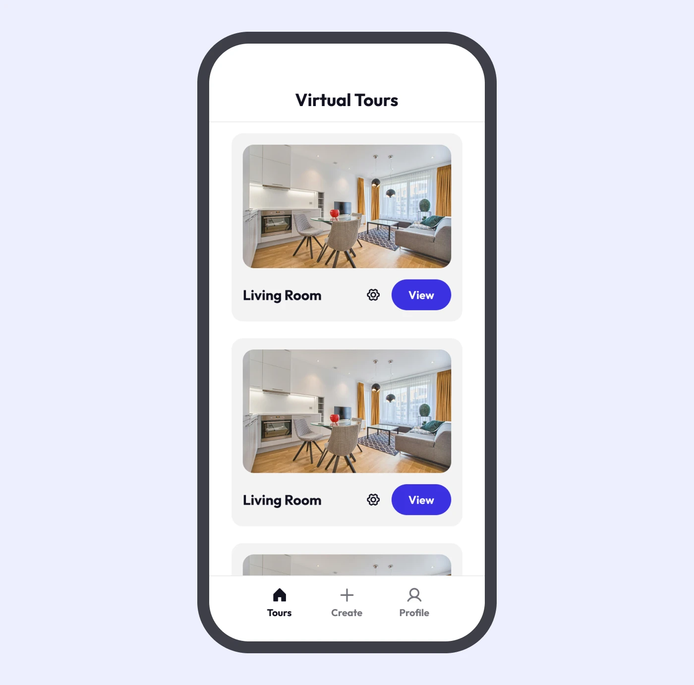
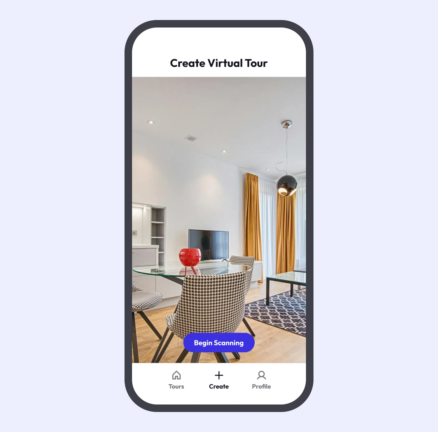
The company uses a mobile app developed in Unity for creating virtual tours, in addition to a web viewer. I focused on designing the mobile app experience. The app has 3 primary pages: virtual tours, create virtual tours, and profile settings. I used a bottom navigation bar for simplicity, and to make it more intuitive, as users are likely to be familiar with similar navigation from other mobile apps.
In the virtual tours page, users can view virtual tours that they have already taken.
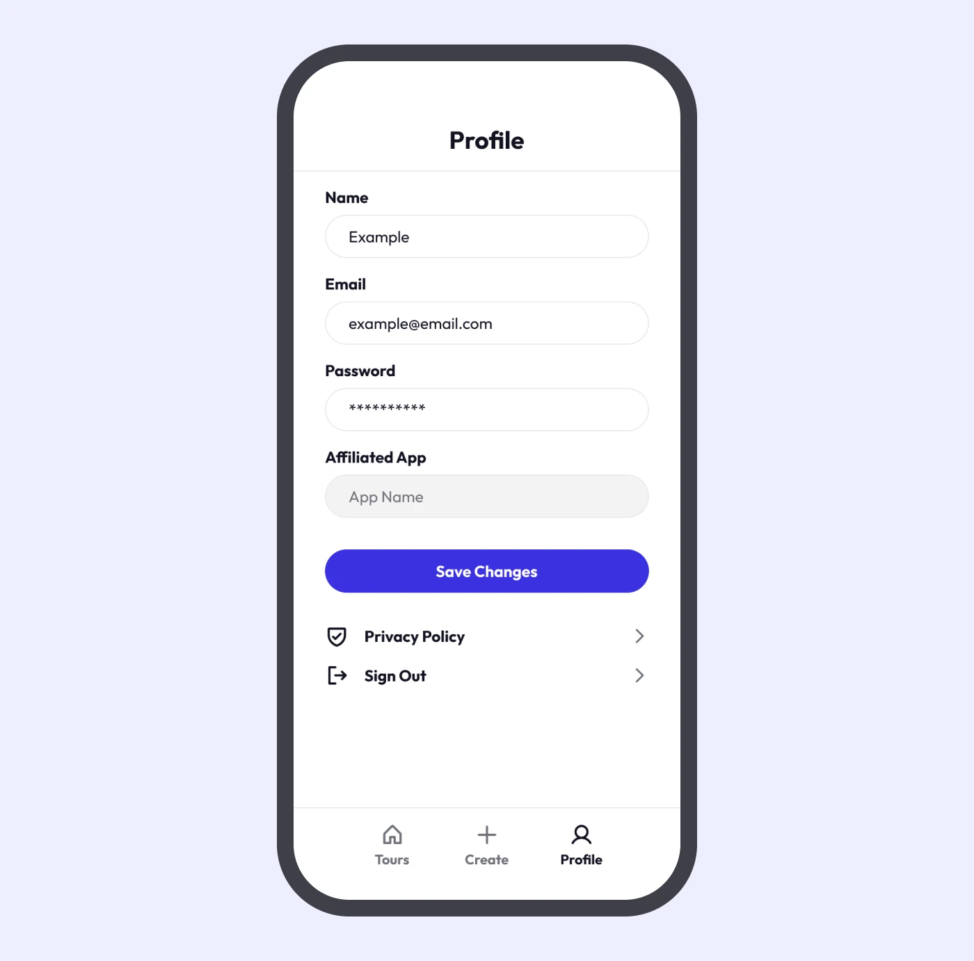
The profile settings page allows users to change their settings, view the privacy policy, and sign out.
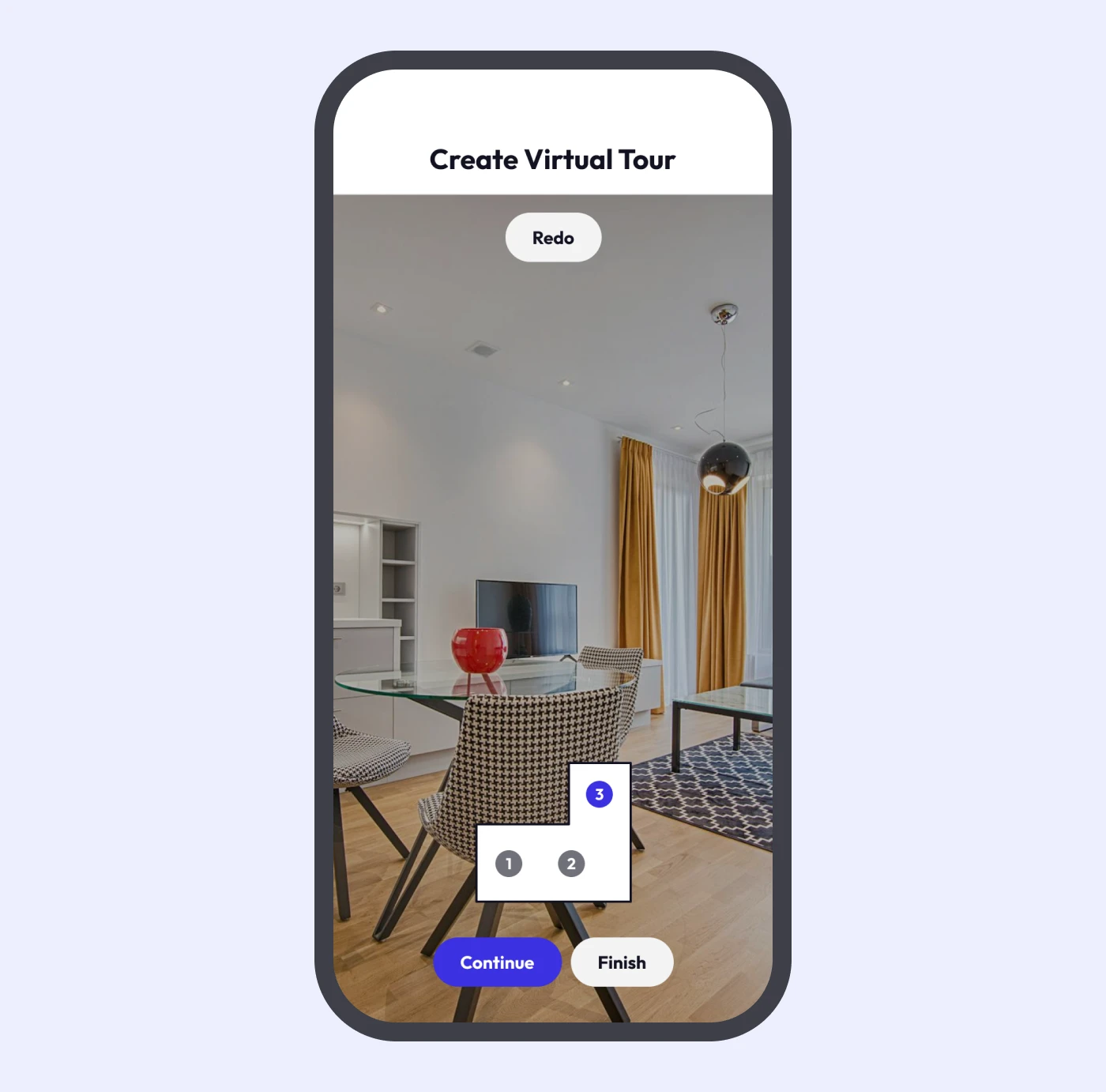
When clicking the “create” button in the navigation, the users would be able to see their camera, and can start creating the virtual tour by clicking the “begin scanning” button.
Afterwards, users would move the solid circle to the empty one, which moves to different locations until a 360 degree scan is completed.
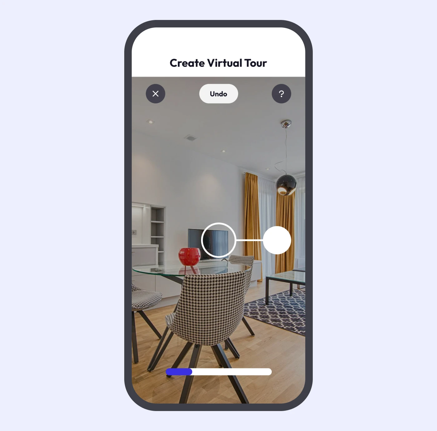
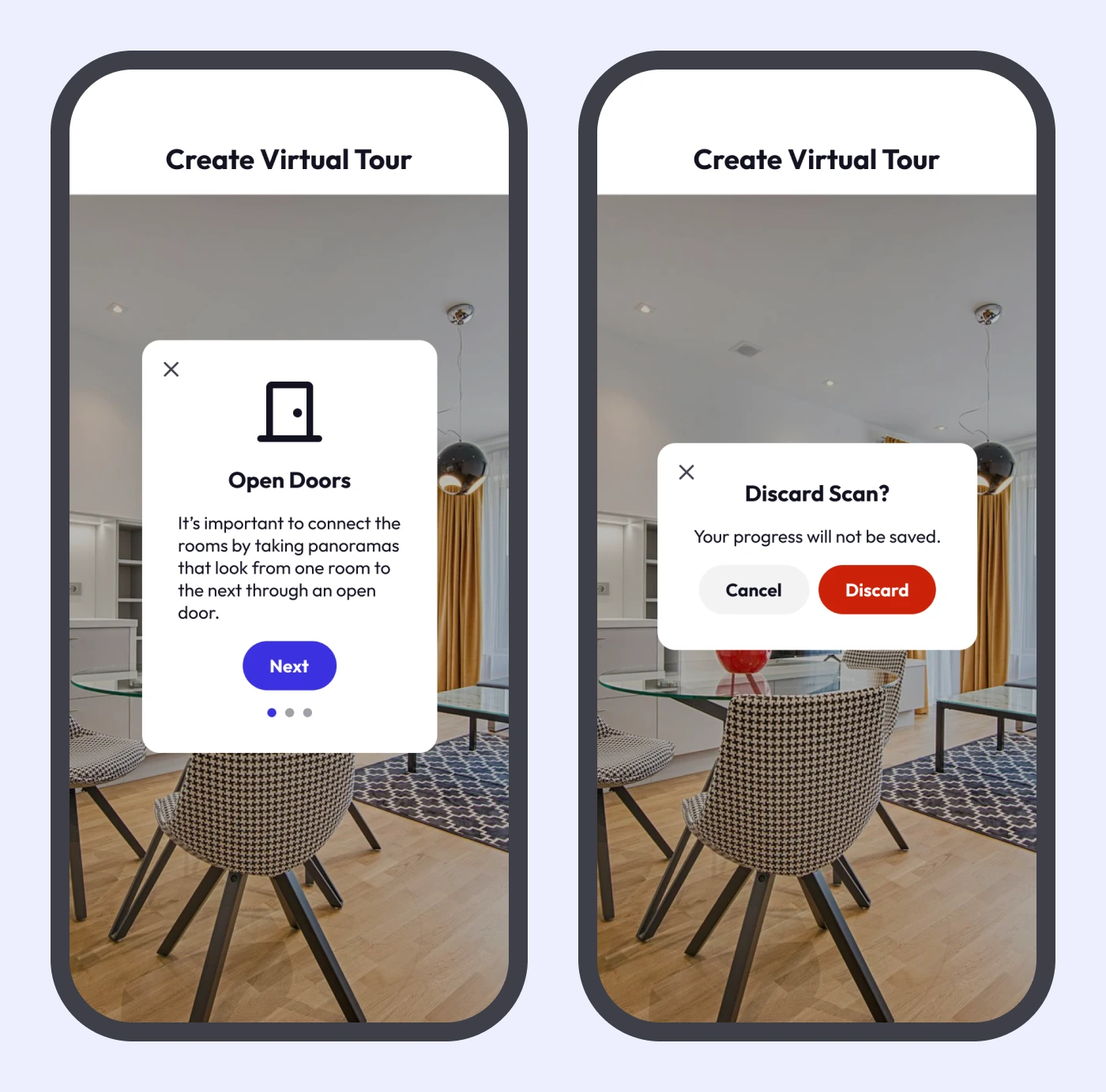
Pressing the “?” icon opens a short guide explaining the process. Pressing the “X” icon opens a confirmation box for discarding the scan.
When a scan is finished, a little loader is displayed to generate the preview.
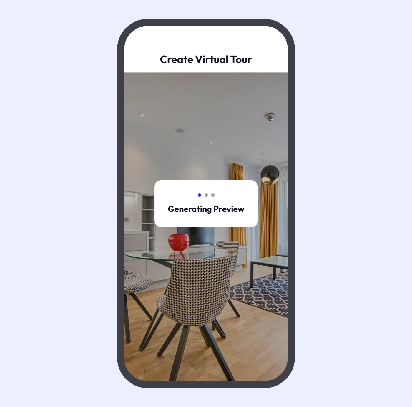
Afterwards, users can continue with the scan by moving to a different location in the home, finish and save the scan, or redo the current room.